


Our beloved bathroom has been “done” for a good while and yet besides a few sneak peeks, I haven’t done a real show and tell. Why? Well, the huge windows (prior to window treatments) really highlighted the construction outside so we had to hold the photo/video until that was done…and then I reshot it because I didn’t like how I styled it. Also, I had to troubleshoot a more permanent change that I wanted to make (that I didn’t). But she is done, shot, and in the can. So over the next few days, we’ll recap where we are, where we came from, and get into some of the juicy details that I haven’t shared yet.
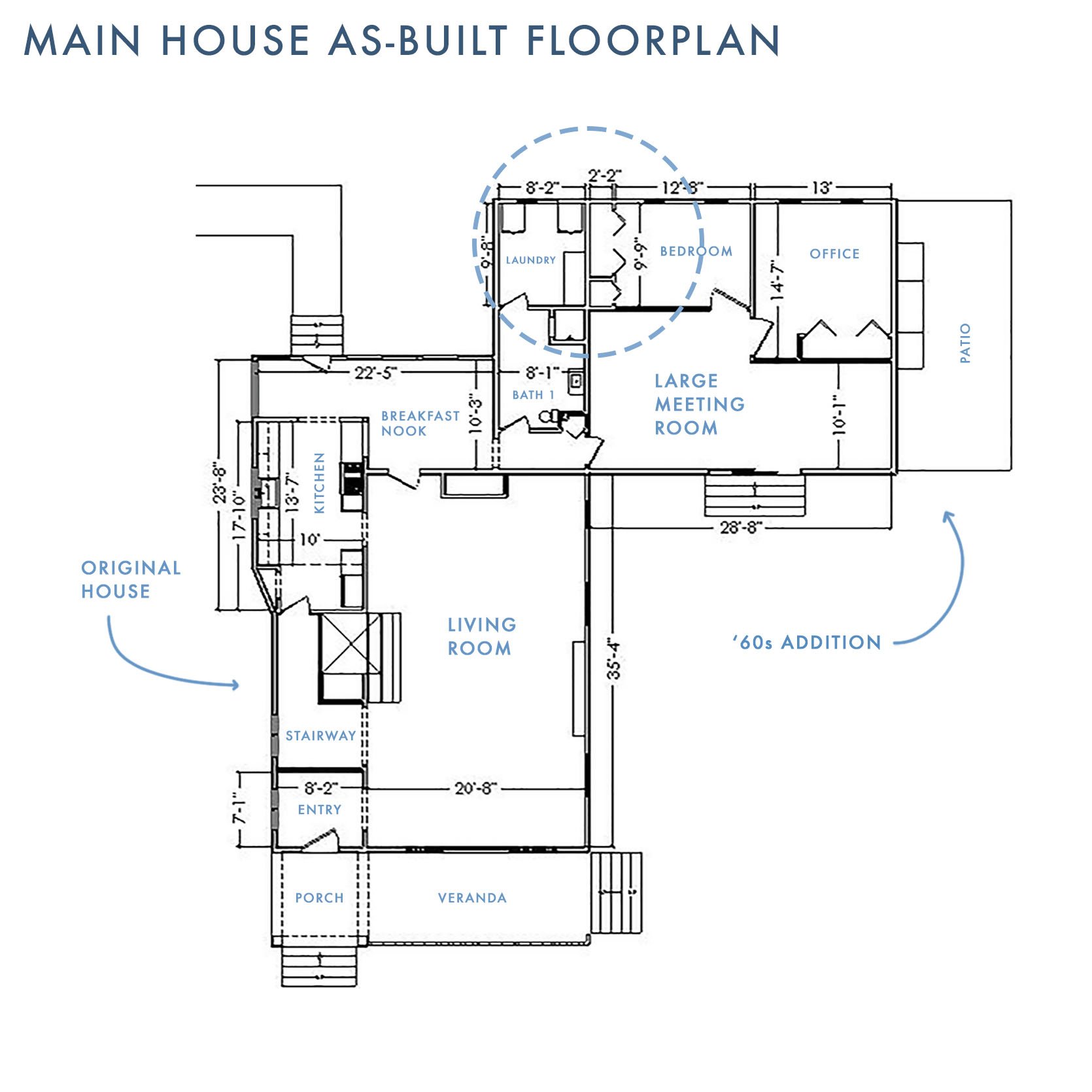
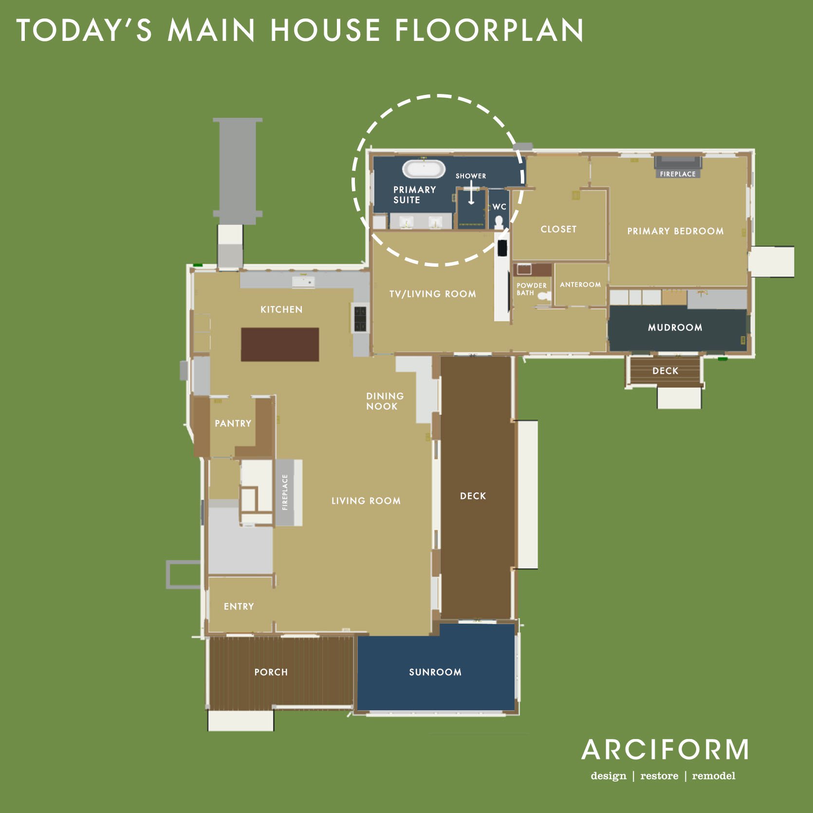
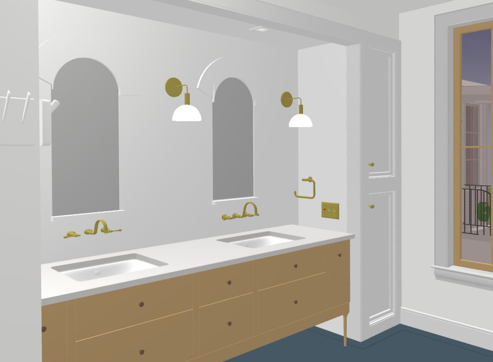
As a reminder, the floorplan on the left is how the house was arranged when we bought it and the one on the right is our current layout. So as you can see we kept it near the plumbing over in that corner, but completely reconfigured it all. It’s in the corner, on the first floor. If you are wondering why we didn’t flop the mudroom and the primary bath I have wondered that a million times. But now that we have these pigs and alpacas and the plunge pool, the mudroom is much closer to all of those dirty/wet things so PHEW.
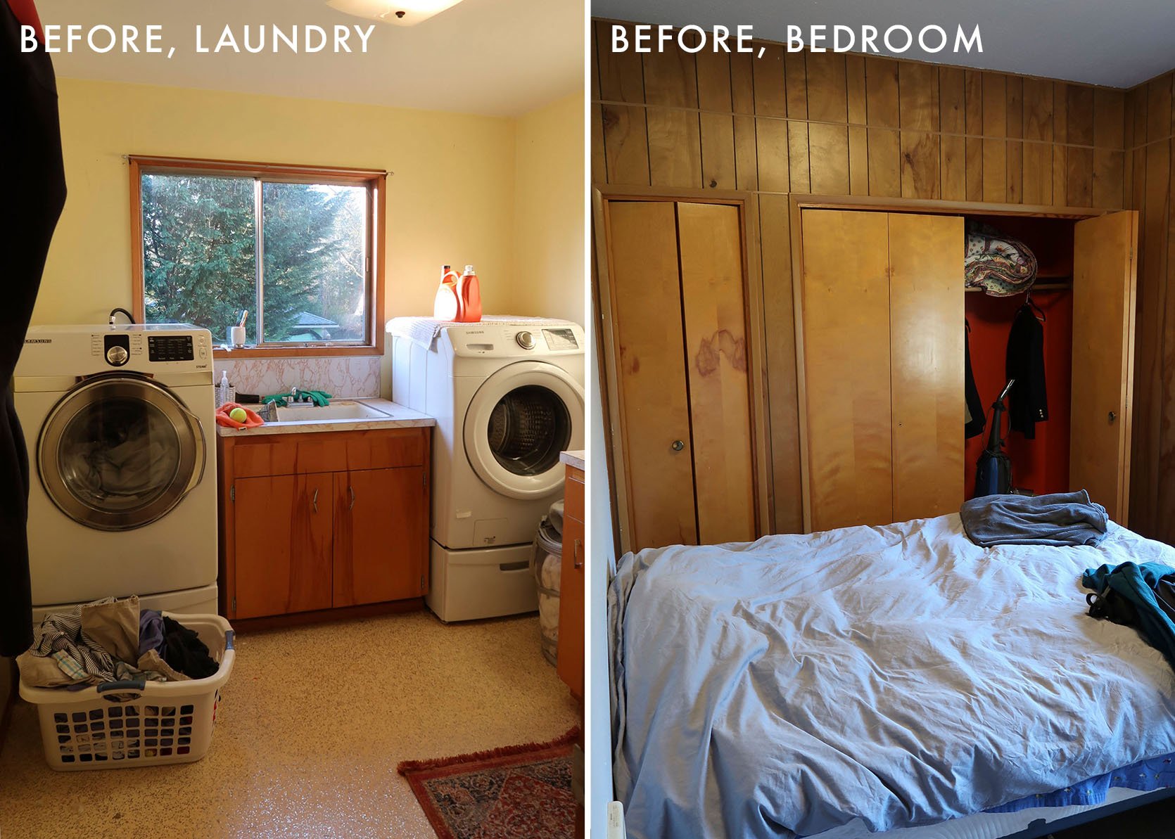
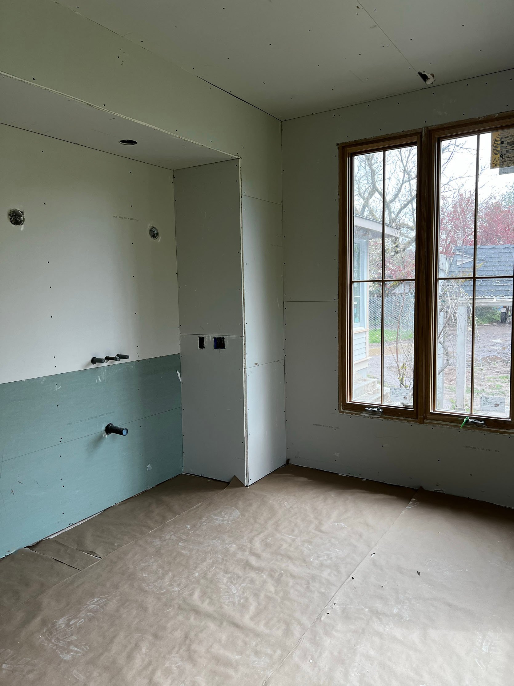
As a reminder, we believe that the ’60s addition (the rectangle off of the main house) was then turned into some sort of adult foster care meeting center in the ’70s or ’80s. None of the finishes were in good enough shape to salvage.
Hiccup #1:
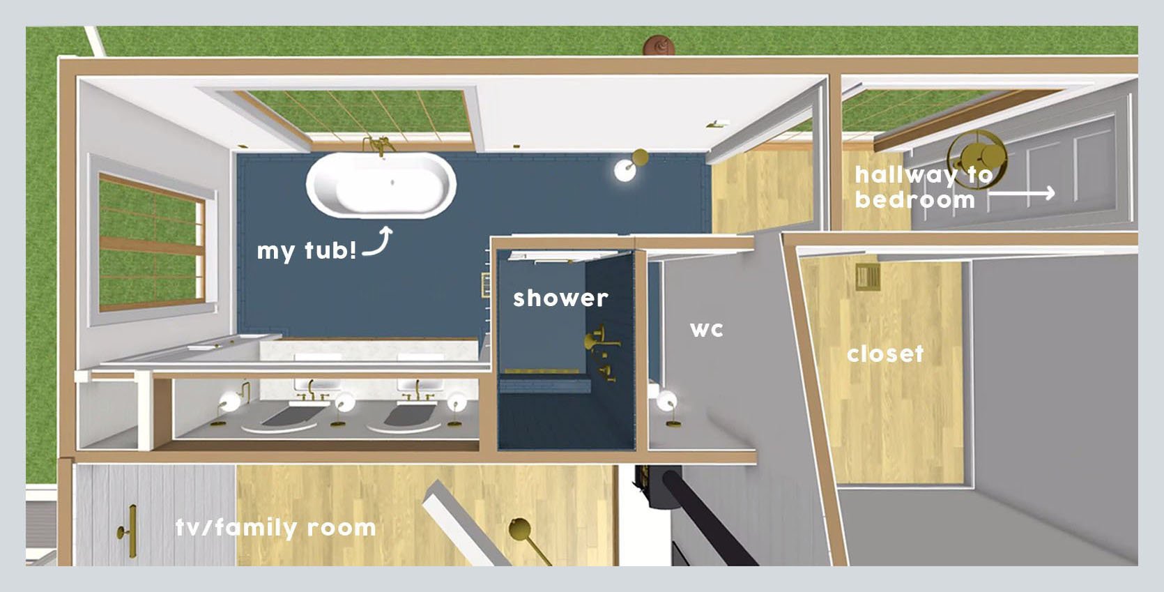
One of my favorite sayings in renovation is “Everything is a THING”. Meaning that every time you change one thing it has a domino effect. Very few changes don’t require you to think about other things. So as you can see in the above layout, we have the tub in front of a huge window, opposite the vanity. Great. But what you don’t know is that for a while we had a cabinet/bench under the east window with more storage. But as we got the cabinetry quote back and needed to cut the budget, we decided to skip it. No problem. But we didn’t catch that the room would be off balance.
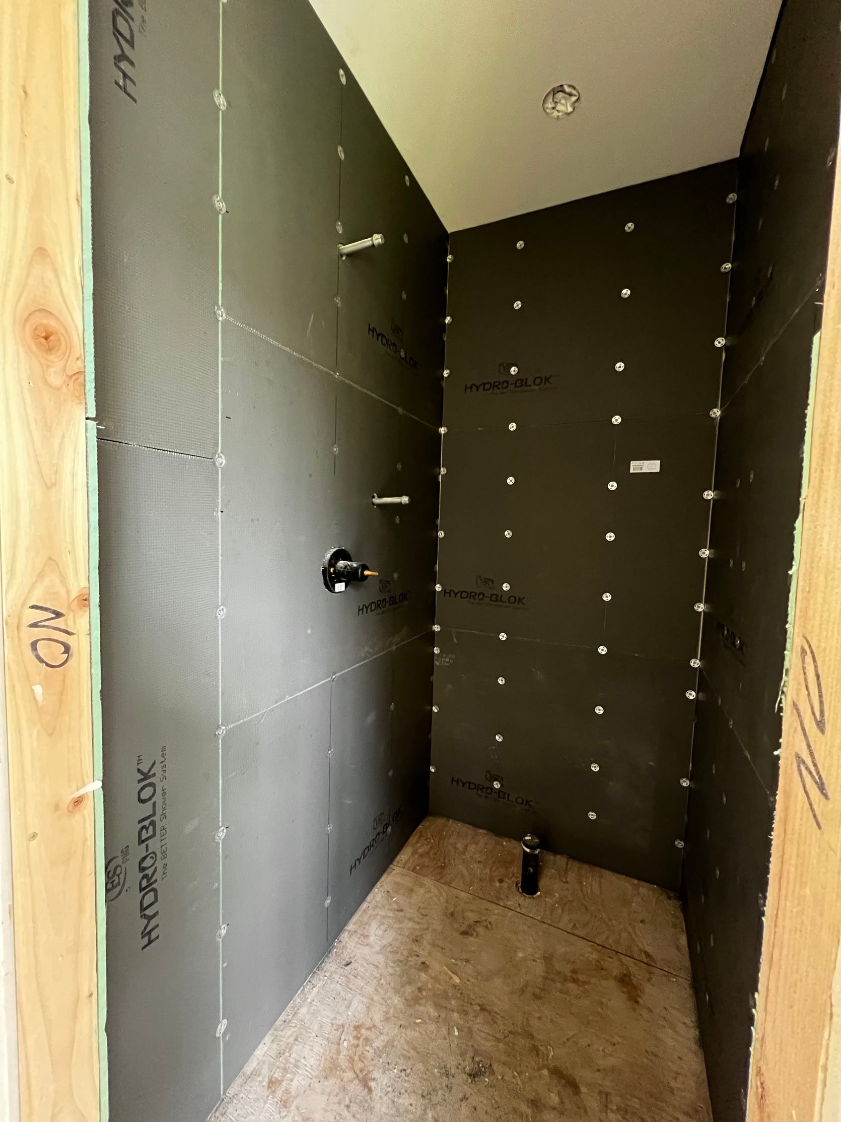
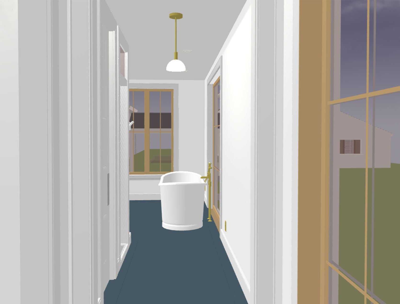
Then after the whole space was framed out and we walked through we realized that the clearance between the shower corner and the tub itself was pretty narrow. Was it doable? Sure, but it was just so odd how tight it was there, but then have so much space on the other side. So we had three options:
- Make the shower room less deep (which would make the toilet room also less deep) giving some of that space to the hallway. Our shower is definitely a good size, but not huge. Like, my brother already thinks it’s too small for him (it’s not, but I get it – it feels tight to him). For the record, I love the size of it – fits two people should that be your thing, but warms up easily whereas huge showers can take a while to warm up and can feel really exposing. It feels nice and intimate but no I didn’t want to go smaller.
- Move that HUGE window to the left (the tub would follow suit and remain centered). This was actually a doable option framing-wise but would require our engineer to re-submit plans to ensure that the sheer wall (the corner support) could still be solid enough. It’s a whole formula – you need enough corner support depending on how tall your ceiling is, how big your windows are, how big the house itself is, etc. Re-framing the window was a 2-day thing (and a couple of thousand dollars to be sure), but going through the engineering and permitting process again was a big “hell no” for us.
- Move the tub to the left, therefore having it not be centered in front of the window. NOT IDEAL, but since they hadn’t finished the rough plumbing nor tile floor it was definitely an option.
- Leave the clearance as-is (24″) and put something (like a piece of furniture) on the other side of the tub under the window to make the extra space there feel more intentional.
We ended up doing #3 – off-centering the tub in front of the window by cheating it back towards the other window. The rest of the options weren’t acceptable.
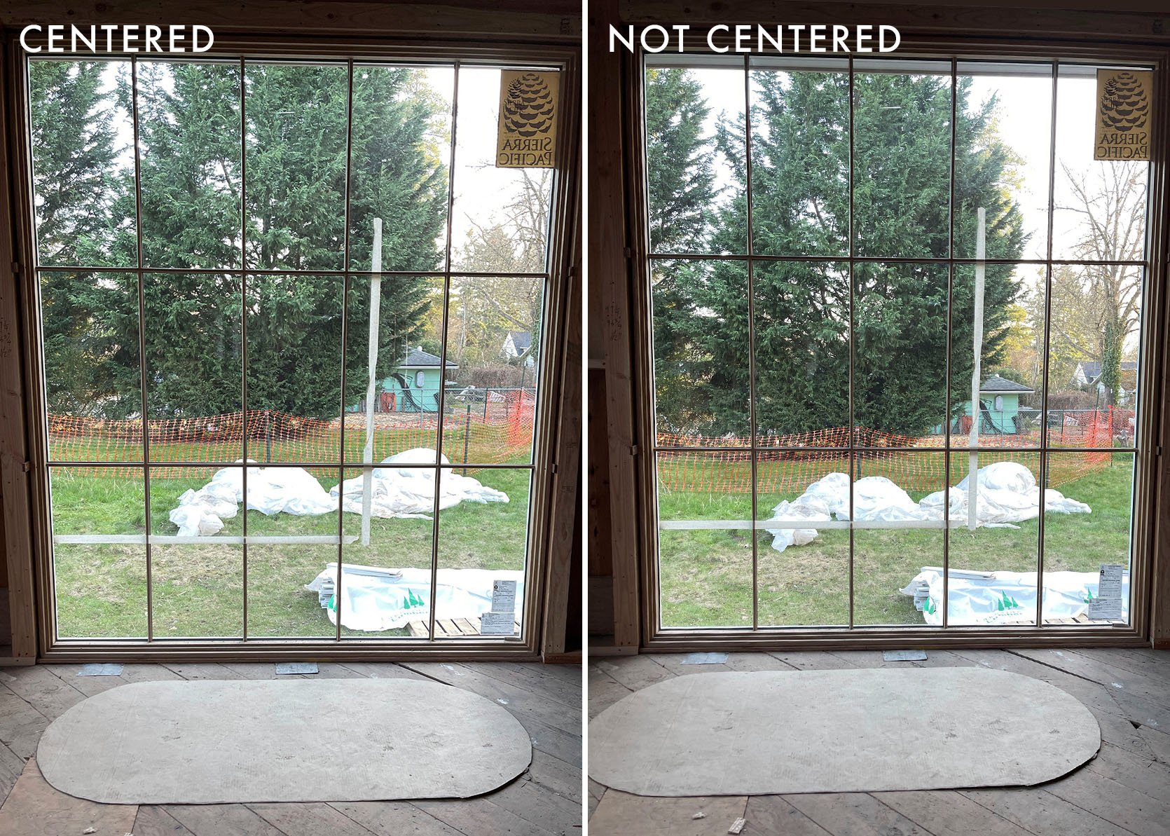
My hope was that once the floor tub faucet was in you wouldn’t notice the lack of symmetry anyway. We actually decided to move the floor faucet from directly behind the tub (centered on the tub and in front of the window) to the left of it. We, of course. thought about putting it to the right but that felt weird to walk into plumbing from the hallway. Now, if this window and tub moment was viewed straight on you would ABSOLUTELY notice how off-center it was, but since you never view it straight on (unless you are sitting on the vanity) my hope was that your eye wouldn’t clock it.
That’s all to say that while this is a nuanced and VERY specific situation, for those of you who have felt you were in an impossible “no perfect solution” scenario, you aren’t alone and this happens frequently in a renovation. There is no room for inflexibility and perfectionism in this process – you make the best choice and hope you don’t notice it later.
Now On To The Tile…
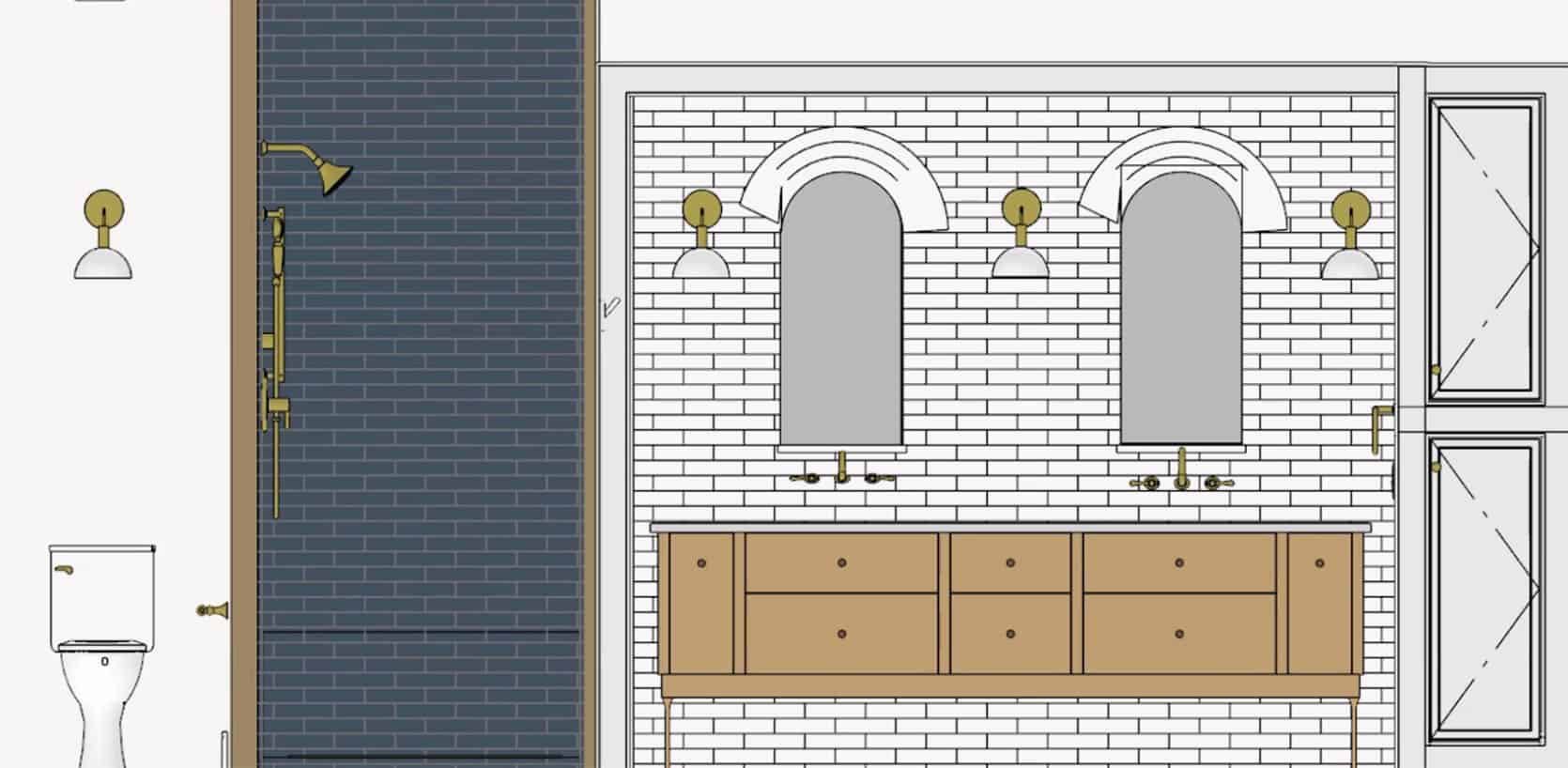
As you know I’ve got a real “formula” for many a room in my life – blue, white, wood, brass, and a LOT of natural light. Obviously, this isn’t strict, but for this room, I wanted airy simplicity. So for the tile, I wanted a field of blue on the floor and white on the walls. Sounds boring (and definitely on the simpler side) but now that I’ve been using and loving this bathroom for over a year I LOVE IT.
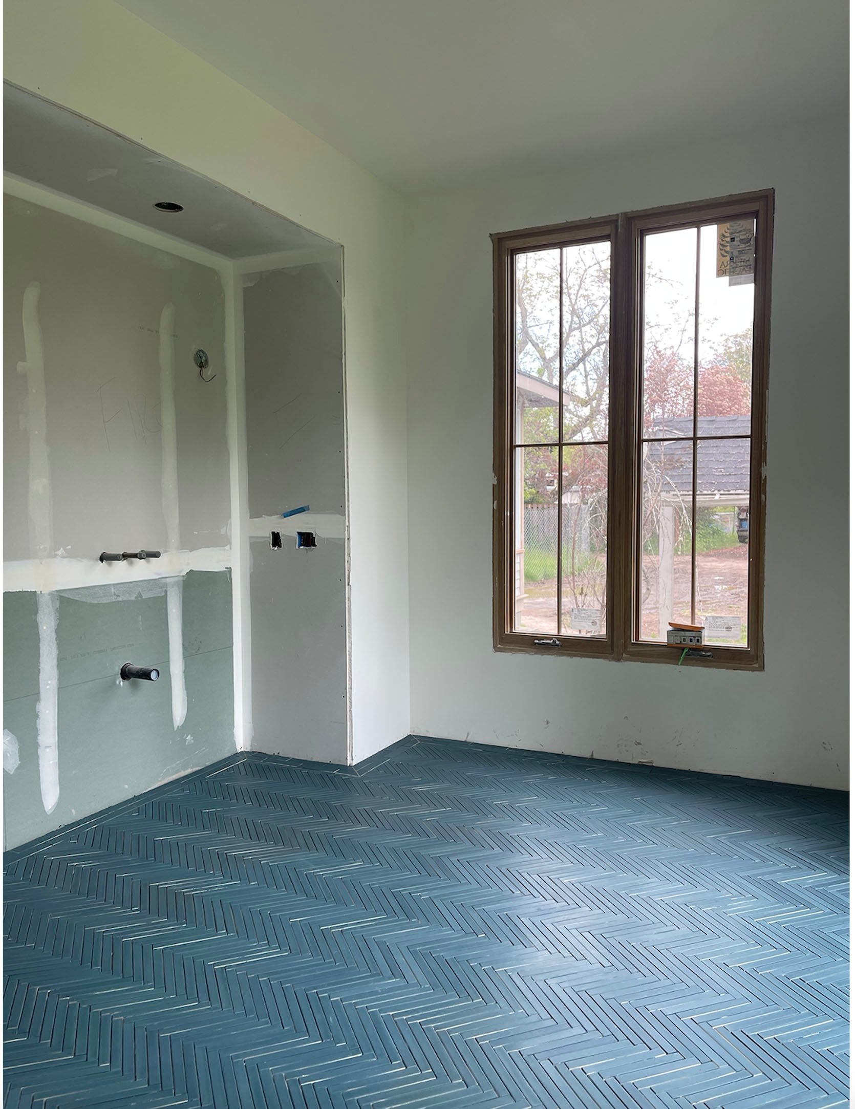
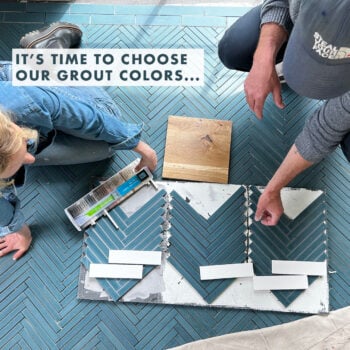
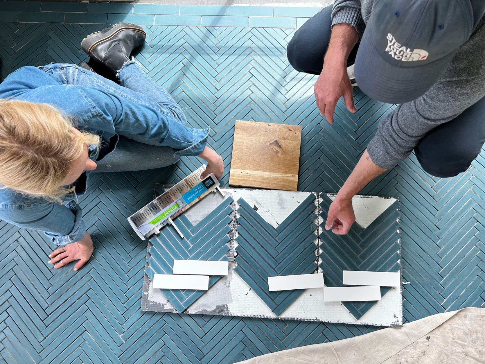
We worked with Pratt + Larson (a Portland tile company that can customize ANY tile color, shape, and has a million finishes). I wanted the floor to have visual movement and texture but not a busy pattern. So we chose these 1×6″ pencil tiles and installed them in a herringbone pattern with a brick-shaped running bond border.
We went with a blue grout that almost matched the tile but there are times (mostly when we are shooting the bathroom) that I wish I had done more of a contrast so you got more of a sense of the herringbone. But when the sunlight hits it, it’s SO PRETTY. It just doesn’t read that well on camera (which is a hilarious career problem).
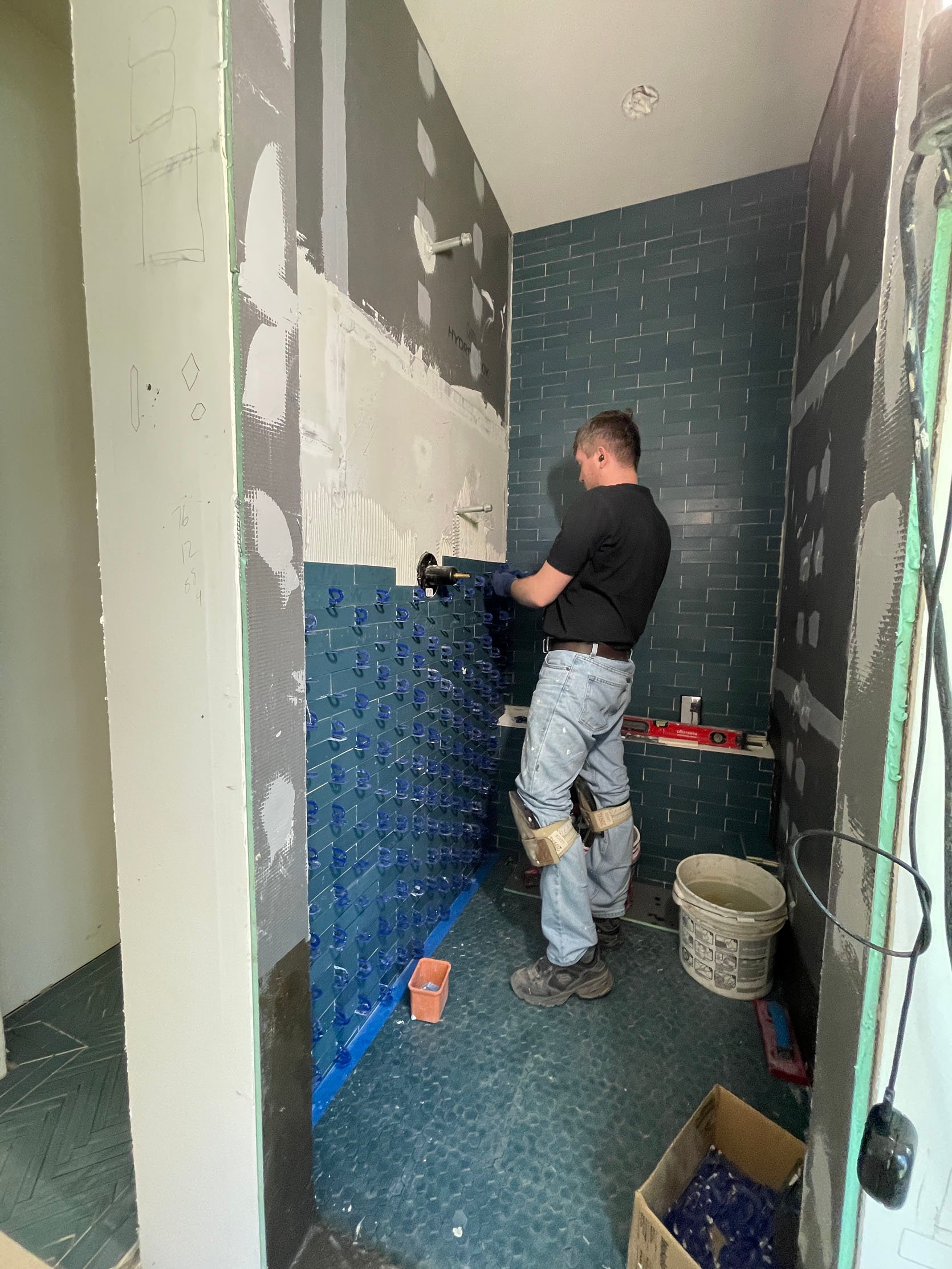
The shower is the same colored tile, but in a 2×6 brick instead on the walls (and ceiling!!), mixed with a smaller scale hex on the floor. Fun fact – the walls and floor are the same “color” but because they are different shapes and therefore different dye lots, they are SLIGHTLY different (you can see the floor is a lot greener). This does NOT bother me at all and I didn’t notice it until my brother asked about it. Just a good reminder that dye lots are a real thing, especially in more handmade tile brands, which is why you always order at least 20% overage (and never throw away your extra) because the chance of it being the exact same again is not guaranteed.
A Second Hiccup…The Wall Tile
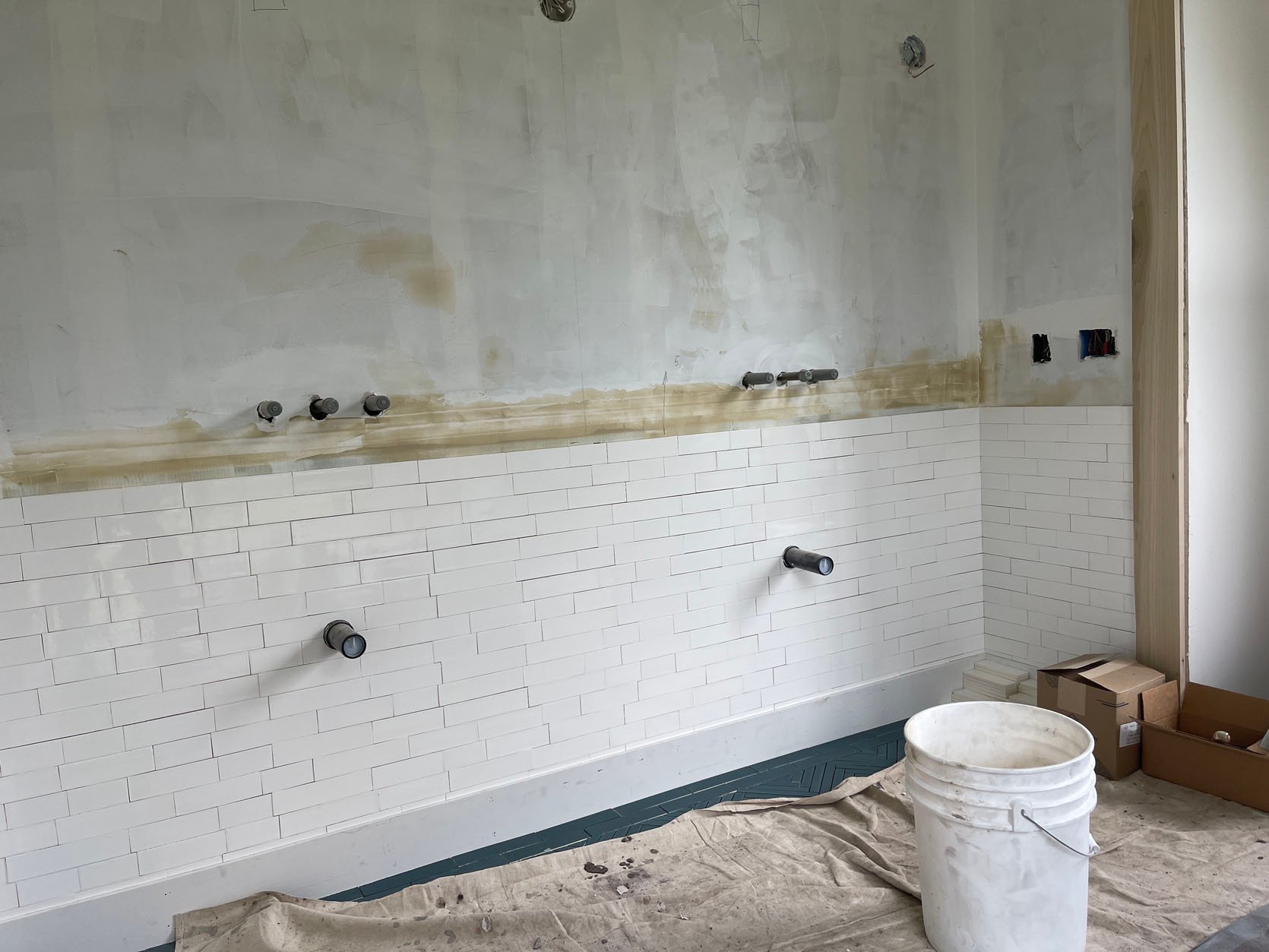
For the wall tile, I had this fantasy/idea of doing different-sized brick tiles (2×4, 2×6, 2×8) and creating a “random” pattern. The idea would be that your eye didn’t really figure it out until it did and it looked like a secret unexpected choice, but not a visible high risk. Great. We laid out the “pattern” so that the vertical grout lines wouldn’t be too close to each other and had it repeat every four rows. The above photo was taken when we were OOT so I didn’t catch that the vertical lines in SOME of the rows in fact were VERY close to each other (def not what I was going for). By the time I saw it the whole thing was installed and so my options were to rip it out or be ok with it. I chose the latter knowing that it was likely the fault of the concept and not the installers. Maybe the math didn’t line up? Or did LOL. I figured that since the grout was going to be white (and a very minimal grout line anyway) you wouldn’t notice. I think where they started it (on the side) affected the pattern and ultimately it lined up more than I had intended at certain points. The reveal is on Monday so you can see what you think of it.
The Vanity…
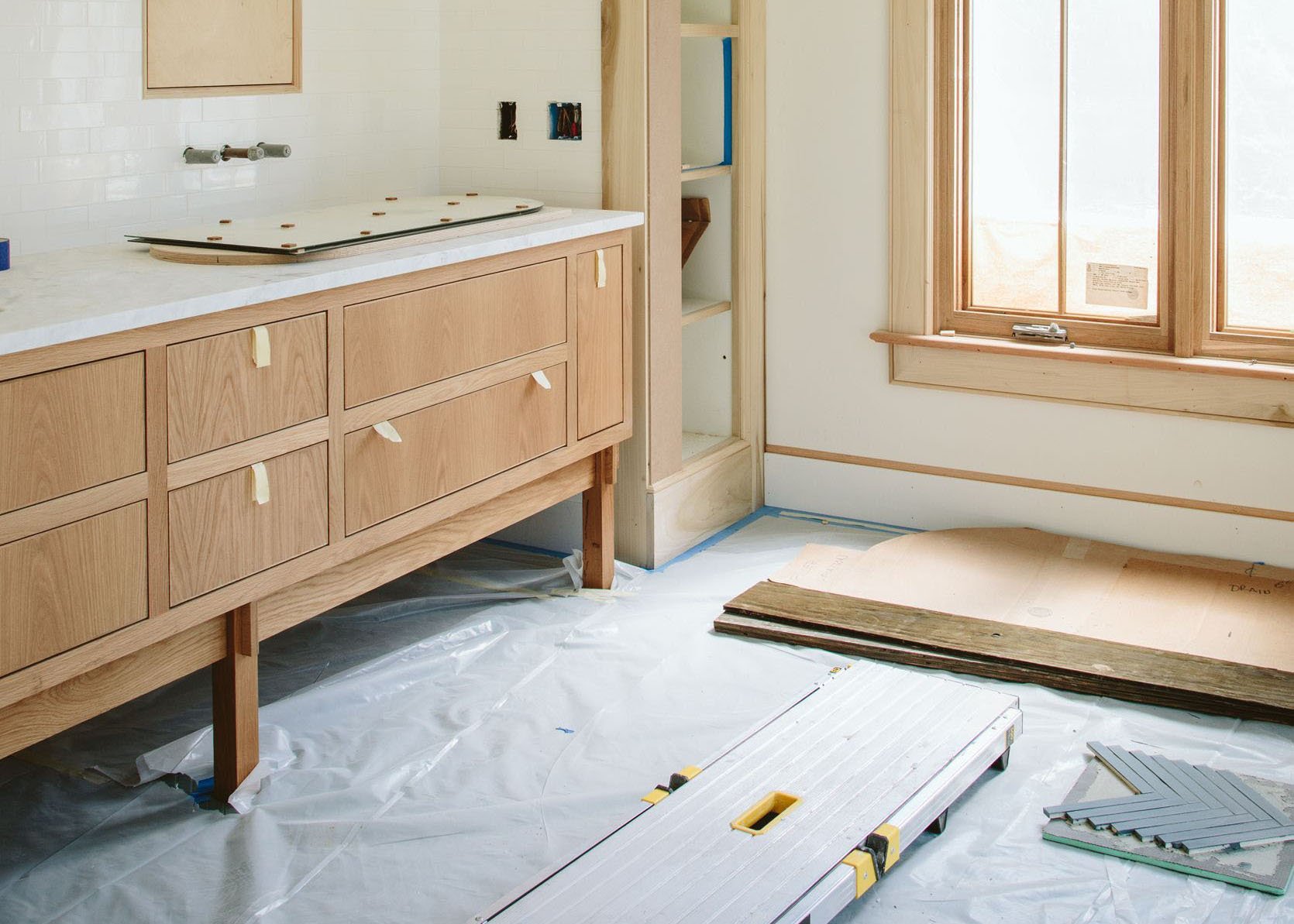
We customized the drawer part of the vanity with Unique Kitchens and Baths (I wrote about it here) and then had the base made by a local maker, Nate Dinihanian. I wanted this fun joinery! In retrospect, I think that UKB could have done it but I think we needed to get the cabinet order in asap as to not hold up the kitchen/mudroom so we decided to design the base later with a local maker.
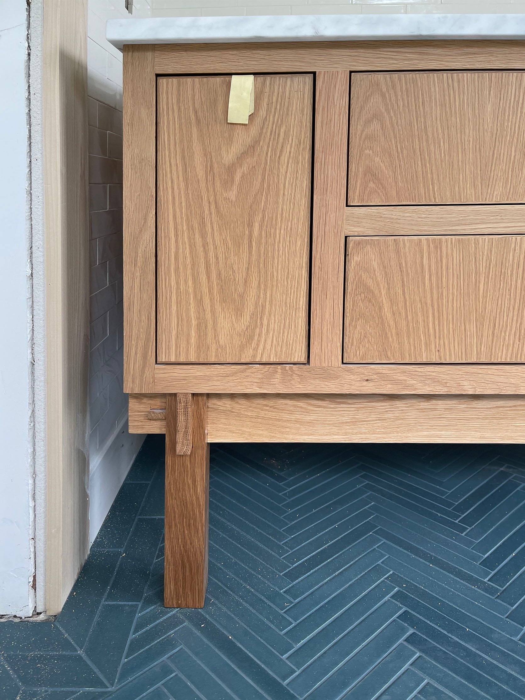
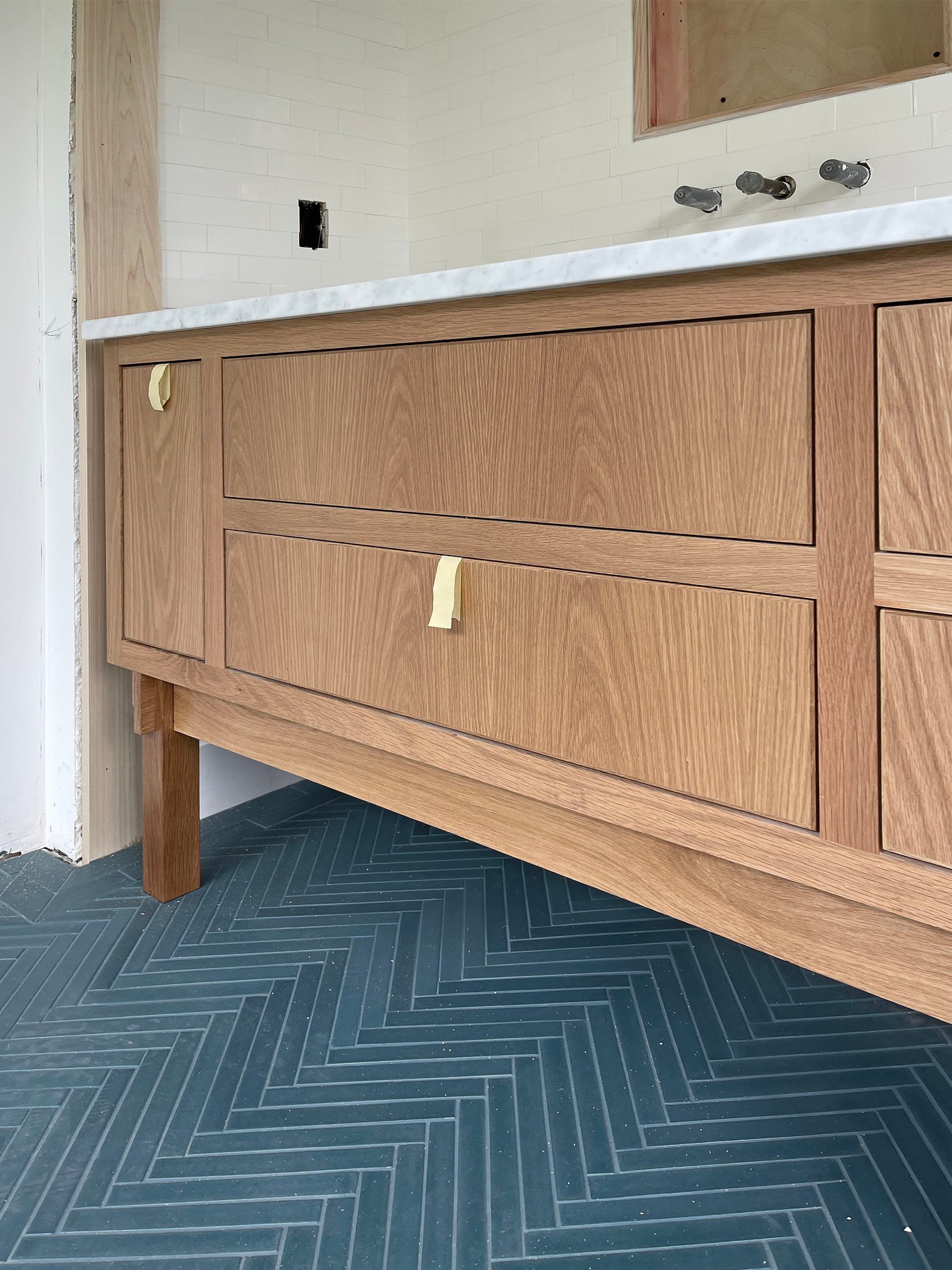
I truly could NOT be happier with how it turned out (and look at that gorgeous grouted tile above – SO BEAUTIFUL).
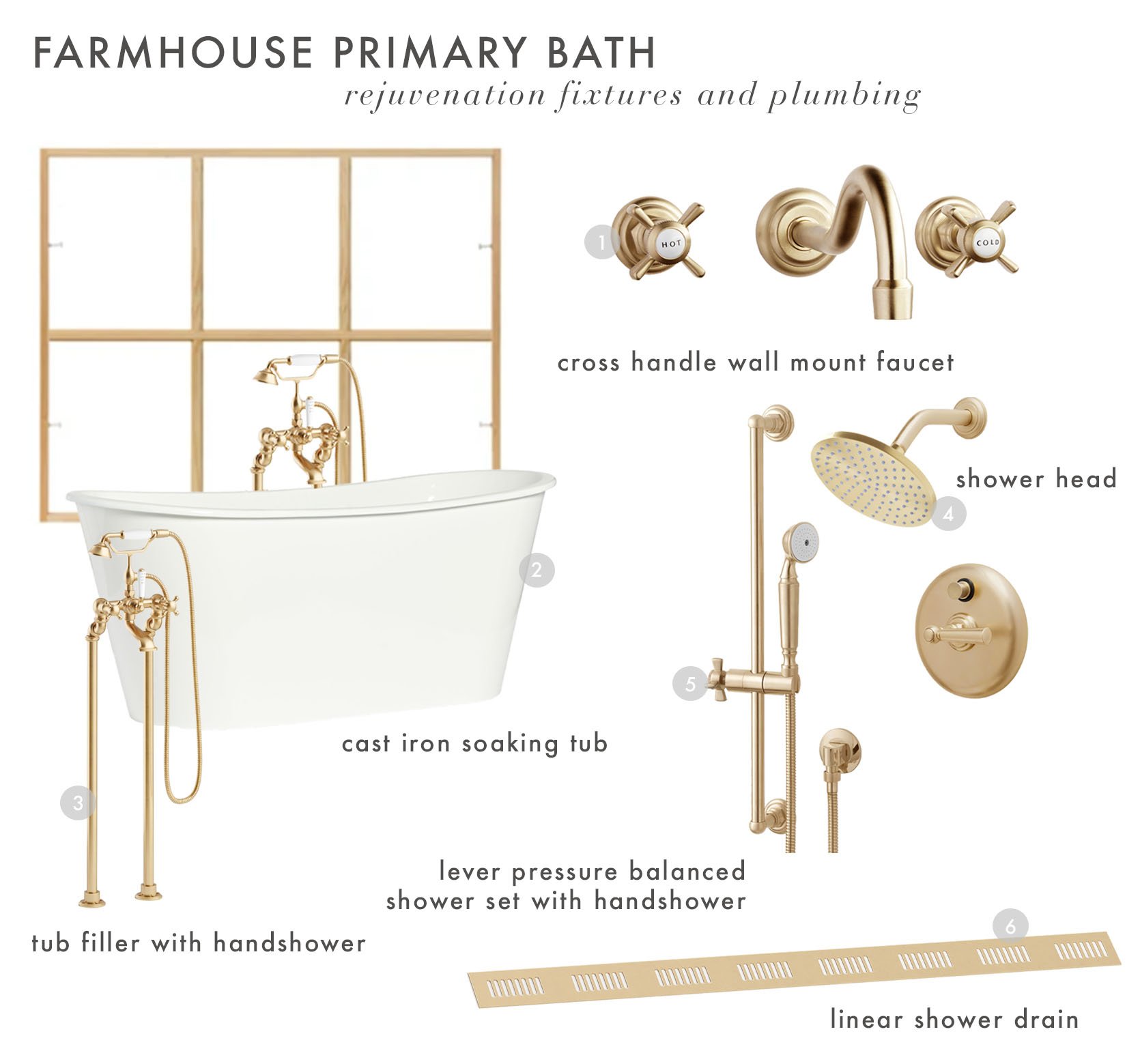
Of course, almost three years ago, we chose all the plumbing and lighting fixtures (all Rejuvenation) which I wrote about here. In case you missed it here’s the mood board so you can see where we are headed.
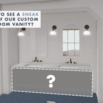
I have to tell you about our medicine cabinets next (it’s a real thing) and then come back Monday to see how it all turned out. 🙂
*Pretty Photos by Kaitlin Green